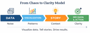
Organizations are not short on data; they are overwhelmed by it. Dashboards multiply, reports expand, metrics update in real time. Yet more information does not automatically create better decisions. In fact, without clarity, data can create confusion, disengagement, and analysis paralysis.
The difference between noise and insight lies in two disciplines that are often underestimated: visualization and storytelling. When used together, they can change how teams observe complex information through narratives that teams can understand, remember, and act on.
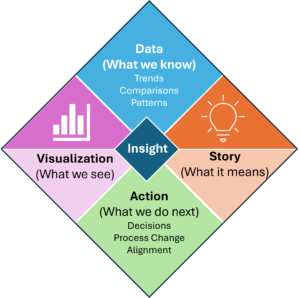
Data Alone Is Not Enough
Data is about numbers. It’s the quantitative side of things. People respond to meaning. It’s the qualitative side of it all.
Most teams do not resist data because they dislike metrics, they resist it because they cannot see how it connects to their work or how it will benefit their teams and organizations. A spreadsheet can show trends, but it doesn’t communicate the “why”. A dashboard may display data well, but it does not explain why it matters.
Presenting data without context is meaningless. Presenting data with context provides further understanding and allows for decisions to be made more easily.
Visualization
 Effective data visualization helps people see data without needing to see what’s under the cover. It highlights patterns and displays information in ways that raw numbers cannot. A well-designed visual allows teams to understand insights quickly. Think about all the articles and textbooks you’ve read. If it weren’t for some diagrams and images, the text may have been lost altogether.
Strong visualizations share characteristics such as:
- Focus on a single message rather than multiple items
- Emphasize trends and comparisons that support making decisions, changing processes, etc.
- Remove unnecessary complexity and “numbers noise.”
The goal is not to impress with fancy “movement or shapes & colors”; it is to create meaning and clarity. A simple chart that drives action is far more valuable than a complex one that confuses.
Storytelling as the Bridge
While visualization organizes information, storytelling gives it purpose.
Storytelling follows an arc. (Think back to middle school book reports!)
It begins with context – Why are we doing this, and where are we now?
It identifies – What challenge or opportunity does the data reveal?
It presents insight – What does this mean?
And it concludes with direction – What should we do next?
When we frame data around a narrative, we can move individuals and teams from passive observation (typical reporting out) to active engagement and critical thinking (driving change). Instead of just reporting numbers, they provide meaning and help with interpretation. Instead of just presenting metrics, they help shape understanding.
A compelling data story answers three core questions:
- Why does this matter
- What is changing
- What is required from us
Connecting Data to Human Impact
 The most engaging stories connect performance metrics to human experience (how is this going to help me and others). For example, a trend in service delays may not just be a percentage change, it could reflect customer frustration or employee workload. A spike in productivity may not just be an anomaly, it may represent improved collaboration or an unannounced change in process. Being able to call these out can help improve productivity overall.
When teams see how data can help change outcomes, engagement increases. The story becomes personal rather than just a read out of numbers and statistics.
Practical Steps for Leaders
Leaders can strengthen data-driven engagement by:
- Starting with the question or decision that needs to be made, not the dashboard or answer
- Limiting focus to the few metrics that are likely to influence the answer or decision.
- Once information is received, structure presentations around a narrative rather than listing metrics.
- Inviting discussion about interpretation rather than assuming alignment.
- Reinforcing progress by revisiting visuals consistently over time.
Practical Steps for Data Analysts
Data analysts can further engagement by:
- Clarify what question the data should answer before starting the analysis.
- Ask Leaders what ‘question needs to be answered beyond the specific data point’ vs. ‘jumping to the exact data point’.
- Collaborate with leaders during the process to spot-check assumptions and data points
- Reinforcing progress by revisiting visuals consistently over time.
Consistency builds trust. When teams see the same measures tied to ongoing stories of progress and learning, they develop confidence in both the data and the direction.
From Reporting to Alignment
Data visualization and storytelling are not communication tactics. They are tools. They align teams around shared reality, clarify priorities, and reduce ambiguity. Most importantly, they help people understand how their work contributes to everything.
When organizations move from reporting numbers to telling clear, focused stories, chaos begins to settle, insight replaces overload, engagement replaces confusion, and teams move forward not because they were given more data, but because they were given clarity.